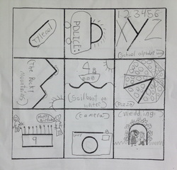
 This has absolutely been one of my favorite projects! The students were caught off-guard and excitedly pushed into a world where they have to be creative. To begin, they were given this sheet and told to turn every shape/line into something recognizable: After students went through the initial "brainstorming" phase, the class discussed in groups which of the nine squares had the most creative solutions and then voted on one design. In the case of the following class, the ">" was chosen: 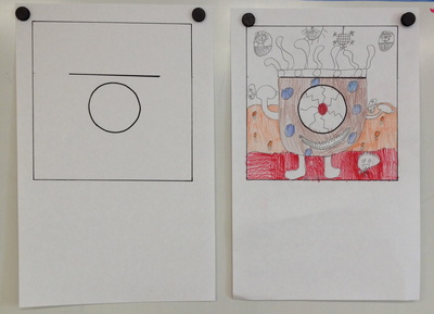 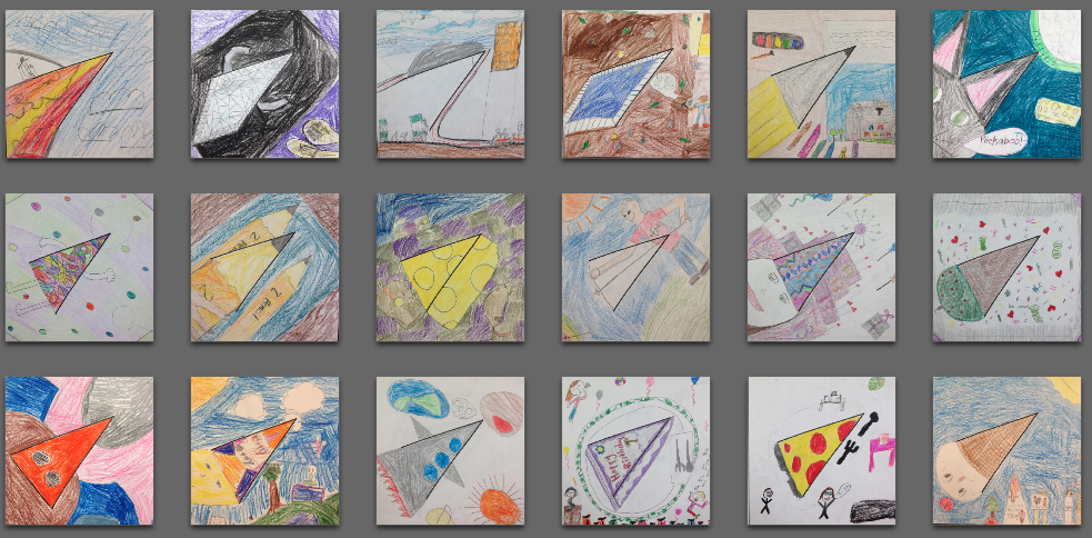 Underneath each drawing, students were asked to write a short description (what inspired them, how they came to their final ideas, etc.). Fantastic project!
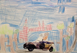 Second graders were asked to find an image in a magazine; it could be any image they wanted, but preferably one they liked. Afterwards, we discussed three depth cues (or, as we called them in class, "clues about things that are closer or farther"): Size, Placement on Page, and Overlap. Students were asked to make one cohesive scene that included the magazine cut-out. Most students really understood the concept, some needed some scaffolding. We also see a theme of trees in almost all drawings because that was the subject I used to indicate depth cues on the board. Haha  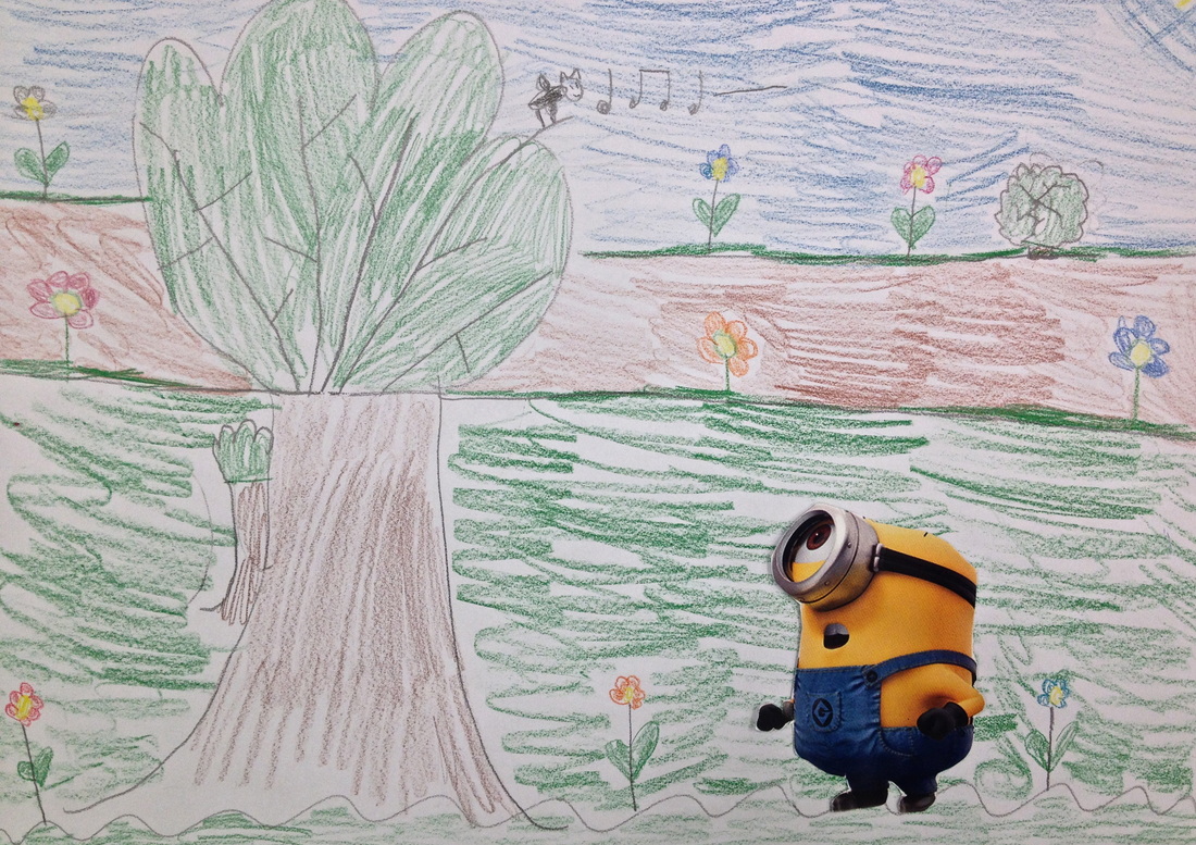 A study of primary and secondary colors using names. This art project was, as always, challenging for some and simple for others. The largest hurdle, folding the paper into 16 equal parts, was only able to be accomplished when students were paired up and directions were given step-by-step (first, fold paper in half, then fold in half again, etc.). The left and right pieces are comparisons of "expected student product" and "product of student who is being evaluated"; here's the question: which piece is more appealing? One could argue that the right piece is far more creative and "abstract" than the left - but how does one find the balance between encouraging unbounded, creative expression and grading for criteria? 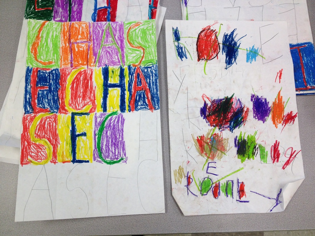 |
AuthorI'm Jacqui Carroll; just Archives
October 2015
Categories
All
|


 RSS Feed
